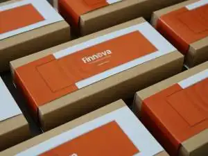
Print design, itself, is an art form. Going from screen to page is a complex process where each step affects the final product—a product, with its full three dimensions, that is fundamentally different from what you’ve created on your 2D screen. We talked with print design experts and rounded up a few things they wish graphic designers knew as they were creating their projects.

Things to Consider During Design
Color Space
When you design in a digital space, your defaults are in RGB. This gives you hundreds of nuanced colors compared to what can be created with the chemistry of the four-color ink process of CMYK. When designing in RGB, remember to do soft proofing in CMYK to reveal what your designs look like with a more limited range, so you can adjust your expectations. It’s also a good idea to calibrate your monitor so that you see what the printer sees.
Even though you can universally identify and communicate color values through something like the Pantone Matching System, getting a precise match for your colors will require adding a spot color to the CMYK process. To get precise colors, it’s common for those spot colors to appear in a 2-color setup for something like business cards, but adding your color to a complete range of tones means adding a 5th color as a special request with the printer, which can be expensive. When it comes to books, custom colors are only really possible with offset orders.
DPI vs. PPI
Digital designers are working in pixels, while printers are working in dots per inch. We’re typically working on high-end retina screens, and these behave very differently from paper. One of the most fundamental differences comes down to size and scale. In the print world, something isn’t 800 pixels wide; it’s 8 inches. Pixels or dots are a measurement of density, not scale. All kinds of things impact required density: What size is the product? How closely will it be viewed? What kind of detail is required for design integrity? 300 dpi is considered the basic standard for book printing, but if you were creating a billboard, you may need only 100 dpi because of how far away something is viewed.
As a designer, this becomes most critical with image choice and file exporting. Make sure whatever you’ve included in your design looks good at the size it will be printed. An image with a dpi that’s too low will look terrible if it’s 2 inches on your screen but is expected to be 7–8 inches on the page of a book. When you’re designing the look, think about the actual scale and surface texture of the product you’re creating so you can be sure you’ve got the right size content that places nicely on your physical product.
Designing for a Physical Object
We can’t say this enough. Remember that you’re designing for a physical object that has to be assembled. In the case of a book, lining up content at the gutter is very difficult. When you design on a screen, you’re designing on a flat surface, so it can be hard to foresee what you’ll lose to the folds of the page or the curves of the cover. Even if you’re working with bleed and trim guidelines from the printer, there’s still no perfect guarantee. As you create your layouts, don’t lose sight of the pages in a book. How will it look and feel in the actual hands of the viewer, who may not hold it perfectly flat? How can you account for the way the eye moves around a physical space?
Top 5 Mistakes Designers Make in Print Files
1.No bleed lines. All documents that go to a printer need to have bleed lines; bleed lines allow the printer to grip the print surface as it passes through. Blurb’s Plug-in for Adobe InDesign sets up your artboard with the required bleed lines, but if you’re working with something else, when you design to the edge of the page, make sure your file includes at least 3mm or .25 in. bleed lines.
2.File output and RIP settings. If your design includes transparencies, gradients or drop shadows, you’ll need to check with your printers on how they want those settings. Each printer has a different raster image processor (RIP), and this will impact how it reads the data in your PDF and outputs your project. While this is true for any printed work, transparencies (something like overlaid logos), drop shadows, and color gradients are particularly tricky. Files are easily misread and you end up with awkward output. Make sure your print file has handled these in a way that’s compatible with your particular printer so that you don’t have errors.
3.Font choices. Our screens are capable of much finer detail than most inks and papers can manage. Without even touching the tricky area of font licensing, it’s worth double-checking your type design. You have to make sure your fonts and their sizes will still be readable once they hit the page. Most printers have a tolerance, and fonts below 6 pt or strokes and serifs that are less than 1 point won’t be visible with the ink and texture of the paper. Check the printer’s guidelines so you can meet the requirements up front.
4.Borders. Remember that in book production, pages are printed separately, assembled and then trimmed. What makes a border effective is having it perfectly parallel to the edge of the page, but in the printing and assembly process, this is extremely difficult to get right every page, every time. If there is variation from page to page and copy to copy, it will be around the edges. This means you should exercise extreme caution or even avoid using borders that depend on alignment with page edges.
5.Total Ink Coverage (TIC). As with anything, the physical printing process has some inherent limitations. The texture and viscosity of the ink means it can be applied only in certain ways, and it requires drying time. Papers have an absorbency limit, so there’s only so much ink it can hold without warping or losing clarity. And Machines can output only so much ink onto so many pages before the printer heads get worn down or it jams. Bear in mind that your monitor shows you the deepest blacks and richest vibrancies, but you’ll likely have trouble replicating that on paper. You might remember that the CMYK printing process involves color layers, and it’s a good rule of thumb that you can’t exceed a 300% build of all the colors. This means the printer can lay down 100% Cyan, 100% Magenta, 100% Yellow, or 50% Cyan, 100% Magenta, 50% Yellow and 100% Black. When you’re designing your colors and opacities, keep this in
mind, and maybe prioritize saturation based on color importance.
The best thing to do is ask a lot of questions with your print specialists. It’s easy to forget just how technical and difficult it is to take something to print, because it’s gotten easier and easier for people to take their designs to print in the era of digital printing. It’s not just pushing a button, and with a little care, your piece can benefit from the art of great graphic design and the art of beautiful print design.
by PrintMag
by Jessica Ruscello at Blurb, Inc.


